Page Bean Components are dialogs (XML definition + Java code + resources) that encapsulate a certain aspect to be re-used. Page Bean Components can be complete parts of a page (e.g. an address dialog that can be used everywhere where an address is shown) or can be simple controls with specific additional functions (e.g. a field in which certain checks and validations are automatically done) – the level of granularity is up to you.
All resources of Page Bean Components (the .xml layout definition, the .class file of its compiled Java source, the .svg files of images, ...) are loaded via class loader. This means at delivery point of time all resources of a Page Bean Component are part of a .jar-file in which the Page Bean Component is included.
Page Bean Components can be embedded into a page by using the component PAGEBEANCOMPONENT – which is a generic control embedding any page bean component. They can be configured by using the attribute PAGEBEANINITDATA which contains a sequence of parameters (“name1:value1;name2:value2;...”) which is typically passed into the page bean component during its initialization.
Page Bean Components now can be also directly managed as controls of a control library.
Example: instead of defining...
<t:row ...>
<t:pagebeancomponent
pagebeanclass=”org.eclnt.ccaddons.pbc.datagridview2.CCDataGridView2”
pagebeanbinding=”#{d.TestUI.dataGrid1}”
pagebeaninitparams=”persistId:MYUSAGE;filterImage:/images/xyz.svg”>
...
...
</t:pagebeancomponent>
</t:row>
...you now can define:
<t:row ...>
<tpbc:datagridview2
pagebeanbinding=”#{d.TestUI.dataGrid1}”
filterImage=”/images/xyz.svg”
persistId=”MYUSAGE”>
...
...
</t:pagebeancomponent>
</t:row>
This is what the first chapter of this documentation is about: “upgrading page bean components”.
Page Bean Component Controls are an extended variant of Page Bean Components - and transfer them into controls that not only can be configured by attributes but that also write back information.
Let's compare: a normal FIELD-control provides an attribute TEXT – which binds to some property on Java side by some expression (“#{d.TextUI.textValue}”). This expression is used in two directions, the current value is transferred into the control, and changes to the value within the control are passed back into the property.
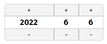
The same now can be done with Page Bean Component Controls: the following Page Bean Component Control TOUCHDATE is a control by which the user can input some date using touch buttons:
The internal processing of the component is a Page Bean processing: i.e. the definition and arrangement of buttons and labels to form a date-dialog is done by a corresponding layout definition (.jsp/.xml) and the implementation is done by corresponding Java-processing.
The control is used in the following way:
<t:rowbodypane id="g_4" >
<t:row id="g_6" >
<demo:touchdate id="g_7" value="#{d.TestUI.dateValue}" />
</t:row>
</t:rowbodypane>
You see: the usage of the control is “just normal” - and does not show the inner structure of the control to the user. The definition of the controls within a layout is identical to a normal FIELD or CALENDARFIELD definition.
The new issue: the page bean processing can write back data to the expressions that are passed. Which means: changes to the date within the TOUCHDATE control directly update the value that is bound by the VALUE-expression.
Consequence: There is no difference between using the TOUCHDATE component (internally being based on Page Bean processing) and e.g. the CALENDARFIELD compoinent (internally being based on Client-side JavaScript processing):
<t:rowbodypane id="g_4" >
<t:row id="g_6" >
<demo:touchdate id="g_7" value="#{d.TestUI.dateValue}" .../>
<t:calendarfield id="g_8" value="#{d.TestUI.dateValue}" .../>
</t:row>
</t:rowbodypane>
Within the Layout Editor the component is available as all other components:
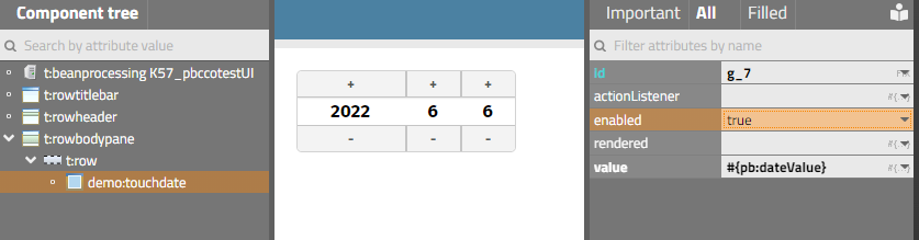
The control provides certain attributes (e.g. “enabled” or “value”) - which can be bound by direct values or by expression values. The binding can be used into both directions – both for reading the data or (in case of expression binding) for writing data.
This is what the second – and longer – part of this documentation “Page Bean Component Controls” is about.
For both scenarios – upgrading Page Bean Components to controls and developing Page Bean Component Controls – you need to define a linkage between the control processing and the Page Bean processing. But: this is rather simple and just a matter of:
registering components in the control tag library definition
Prefix and name of the control
Attributes of the control
defining the usage of the control in certain XML configuration files
in which other controls can the new control be placed?
which are the mandatory and which are the favorite attributes
writing a component class and a component tag class
...both of them just being an extension of existing classes
The major part of creating all the required information is done by invoking the function “Create control library extension...” in the Layout Editor:
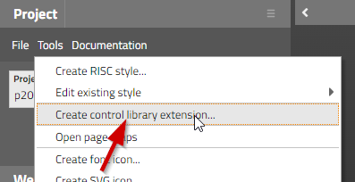
Define
some prefix (example: “demos”
some package (example: “democontrols”)
Certain files will be generated within your project. Most important:
“cccontrollibrary.xml” - this file contains control definitions together with the attributes that are available for the control
“democontrols/resources/controlattributeusage.xml” - this file contains the information how the control is embed-able into other controls
“democontrols/resources/controlattributeusage.xml” - this file contains the information which attributes of the control are mandatory
“democontrols/resources/controlfavoriteattributes.xml” - this will file contains the information which attributes are the ones to be arranged in the Layout Editor within the secion of “important attributes” when editing the attribute values
Two dummy classes will be generated:
YOURCOMPONENTComponent.java
YOURCOMPONENTComponentTag.java
The classes are the ones to be copied and pasted by you to create the Component- and Tag-class for your control.
As example we use our component “CCDataGridView2” which is use-able as control “tpbc:datagridview2”.
The control and its init parameters are registered in “ccontrollibrary.xml”:
<tag>
<name>datagridview2</name>
<attribute><name>id</name></attribute>
<attribute><name>pagebeanbinding</name></attribute>
<attribute><name>shownullcontent</name></attribute>
<attribute><name>rendered</name></attribute>
<!-- attributes -->
<attribute><name>sbvisibleamount</name></attribute>
<attribute><name>gridStyleVariant</name></attribute>
<attribute><name>labelStyleVariant</name></attribute>
<attribute><name>filterImage</name></attribute>
<attribute><name>withPopupMenu</name></attribute>
<attribute><name>persistId</name></attribute>
<attribute><name>selectorColumn</name></attribute>
</tag>
The arrangement inside the Layout Editor is done in “controlsarrangement.xml”:
<tag name="t:row" below="tpbc:datagridview2"/>
<tag name="tpbc:datagridview2" folder="Grids" below="tpbc:datagridview2column"/>
The mandatory attributes are defined in “controlattributeusage.xml”:
<tag name="tpbc:datagridview2">
<attribute name="pagebeanbinding"/>
</tag>
The favorite attributes are defined in “controlfavoriteattributes.xml”:
<tag name="tpbc:datagridview2">
<attribute name="pagebeanbinding"/>
<attribute name="shownullcontent"/>
</tag>
The class “democontrols/DATAGRIDVIEW2Component.java” is:
package org.eclnt.ccaddons.pbc.ccpbc;
import org.eclnt.jsfserver.elements.BaseComponentPageBeanWrapper;
public class DATAGRIDVIEW2Component extends BaseComponentPageBeanWrapper
{
}
There is no specific coding to be added to this class.
The class “democontrols/DATAGRIDVIEW2ComponentTag.java” is:
package org.eclnt.ccaddons.pbc.ccpbc;
import org.eclnt.ccaddons.pbc.datagridview2.CCDataGridView2;
import org.eclnt.jsfserver.elements.BaseComponentTagPageBeanWrapper;
public class DATAGRIDVIEW2ComponentTag extends BaseComponentTagPageBeanWrapper
{
@Override
protected String getPageBeanClassName() { return CCDataGridView2.class.getName(); }
}
The only coding you need to do is to override the getPageBeanClassName() method and return the class of the Page Bean Component that should be used inside the control.
In case of the CCDataGridView2 component, the configuration also includes sub-configurations, which are at runtime passed by the method:
@Override
public void initializePageBeanConfigItems(List<PageBeanConfigItem> configItems)
{
super.initializePageBeanConfigItems(configItems);
...
...
}
These sub-configurations also need to be transferred in to a corresponding control – following the exact same procedure which was descrived in the previous text:
Registering them with a certain name as controls, here: “tpbc:datgridview2item”.
Implementing the two clases.
Developing a Page Bean Component Control means that two aspects of CaptainCasa development are combined:
Adding a new component to the CaptainCasa control set.
CaptainCasa allows to add own control libraries, each one having an own prefix. Inside the control libraries each control with its attributes is listed (.tld file, tag library definition) and per control an explicit “Component” and “ComponentTag” class need to be provided.
Implementing a Page Bean Component implementation that reflects the definition of the control.
This is the normal implementation of a page bean – with some extra functions to flexibly access the attribute-value-assignments that are defined at runtime. (Sorry: this sentence sounds like rocket-science, but will be understand-able after reading the following chapters...)Building “real” controls with PageBeanComponents
We want to create a component “TOUCHDATE”:
The component is based on Page Bean Component processing and is use-able as direct, “real” control:
<t:rowbodypane id="g_4" >
<t:row id="g_6" >
<demo:touchdate id="g_8" actionListener="#{d.TesttouchdateUI.onSomeDate1Action}" enabled="true" value="#{d.TesttouchdateUI.someDate1}" />
</t:row>
</t:rowbodypane>
The component binds via expression to a property in “just the normal” way:
...
public LocalDate getSomeDate1() { ... }
public void setSomeDate1(LocalDate value) { ... }
Within the Layout Editor switch to the “Source” tab and create a layout in the following way:
You may use the same package that you also used when defining the control library extension – or any other package. The package in which you place the page bean component does not need to be the same as the package you defined during the control library creation
In this demo case we will use the package “democontrols” and execute popup menu item “New layout...”. Select the template “Page Bean Component Control” from the list of templates and define the name “TouchDate”.
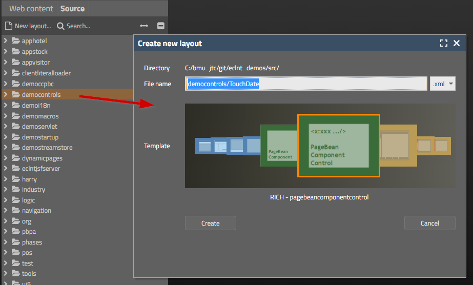
The name “TouchDate” will be the central name that is used for your component at multiple places from now on.
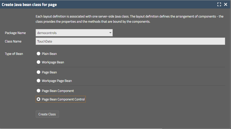
After creating the layout the Layout Editor will open a dialog in which you define the class name for the component. Stay with the defaults that are proposed:
The following files will be generated:
The Page Bean Component “democontrols/TouchDate.java” - this is the normal Java code that is the counter part of the layout “TouchDate.xml”.
The control classes “democontrols/TOUCHDATEComponentTag.java” and “demcontrols/TOUCHDATEComponent.java”
The properties-file “democontrols/TouchDate.properties” for translating literal ids into texts.
Inside the “TouchData.java” file you will find additional information for registering the component.
The “#{d}”-dispatcher must “see” the package in order to directly start the component implementation in the Layout Editor
Define the content so that the package of the component is included
<dispatcherinfo>
<managedpackage name="demcontrols"/>
</dispatcherinfo>
Just use the normal Layout Editor functions to design the layout of your component
Example
<t:pagebeanroot id="g_1" >
<t:pane id="g_2" border="#00000030" comment="Only one component is allowed below pagebeanroot!" rounding="#{ccstylevalue['@containerExposedRounding@']}" >
<t:beanprocessing id="g_3" beanbinding="#{d.TouchDate}" />
<t:row id="g_17" >
<t:button id="g_15" actionListener="#{d.TouchDate.onPlusYearAction}" doubleclickenabled="true" enabled="#{d.TouchDate.enabledValue}" rounding="0" text="+" width="100" />
<t:button id="g_18" actionListener="#{d.TouchDate.onPlusMonthAction}" doubleclickenabled="true" enabled="#{d.TouchDate.enabledValue}" rounding="0" text="+" width="50" />
<t:button id="g_19" actionListener="#{d.TouchDate.onPlusAction}" doubleclickenabled="true" enabled="#{d.TouchDate.enabledValue}" rounding="0" text="+" width="50" />
</t:row>
<t:row id="g_8" >
<t:label id="g_9" align="center" stylevariant="ccbig" text="#{d.TouchDate.dateYear}" width="100" />
<t:label id="g_11" align="center" stylevariant="ccbig" text="#{d.TouchDate.dateMonth}" width="50" />
<t:label id="g_13" align="center" stylevariant="ccbig" text="#{d.TouchDate.dateDay}" width="50" />
</t:row>
<t:row id="g_20" >
<t:button id="g_21" actionListener="#{d.TouchDate.onMinusYearAction}" doubleclickenabled="true" enabled="#{d.TouchDate.enabledValue}" rounding="0" text="-" width="100" />
<t:button id="g_23" actionListener="#{d.TouchDate.onMinusMonthAction}" doubleclickenabled="true" enabled="#{d.TouchDate.enabledValue}" rounding="0" text="-" width="50" />
<t:button id="g_24" actionListener="#{d.TouchDate.onMinusAction}" doubleclickenabled="true" enabled="#{d.TouchDate.enabledValue}" rounding="0" text="-" width="50" />
</t:row>
</t:pane>
</t:pagebeanroot>
The implementation uses the following base classes
PageBeanComponentAsControl
This is a PageBean that is configured directly in the layout by control attributes (“<zzzz:touchdate id=... value=... enabled=.../>”)
The parameters of the attributes are transferred within the “initializePageBean” method
PageBeanComponentAsControlWithAction
Extension of PageBeanComponentAsControl
Component that sends own action events into the processing
The class implements the empty interface “IPageBeanComponentAsControlImplicitlyCreateInstance”
Result: an instance of the component is created internally by the layout processing
If not using this interface then you need to explicitly provide an attribute PAGEBEANBINDING as part of your control definition.
Example:
package democontrols;
import java.io.Serializable;
import java.time.LocalDate;
import java.util.List;
import java.util.Map;
import org.eclnt.editor.annotations.CCGenClass;
import org.eclnt.jsfserver.pagebean.PageBeanComponentAsControlConfigItem;
import org.eclnt.jsfserver.pagebean.componentascontrol.IPageBeanComponentAsControlImplicitlyCreateInstance;
import org.eclnt.jsfserver.pagebean.componentascontrol.PageBeanComponentAsControlWithAction;
import org.eclnt.jsfserver.pagebean.componentascontrol.attributeReference;
import org.eclnt.jsfserver.pagebean.componentascontrol.valuemgmt.AttributeReferenceBoolean;
import org.eclnt.jsfserver.pagebean.componentascontrol.valuemgmt.AttributeReferenceLocalDate;
import org.eclnt.jsfserver.util.valuemgmt.IValueDelegation;
@CCGenClass (expressionBase="#{d.TouchDate}")
public class TouchDate
extends PageBeanComponentAsControlWithAction
implements Serializable, IPageBeanComponentAsControlImplicitlyCreateInstance
{
// ------------------------------------------------------------------------
// members
// ------------------------------------------------------------------------
@attributeReference
private AttributeReferenceLocalDate m_valueRef = new AttributeReferenceLocalDate(LocalDate.now());
@attributeReference
private AttributeReferenceBoolean m_enabledRef = new AttributeReferenceBoolean(true);
int m_dateDay;
int m_dateMonth;
int m_dateYear;
// ------------------------------------------------------------------------
// constructors & initialization
// ------------------------------------------------------------------------
public TouchDate()
{
}
public String getRootExpressionUsedInPage() { return "#{d.TouchDate}"; }
// ------------------------------------------------------------------------
// public usage
// ------------------------------------------------------------------------
// following members are only "valid" during rendering phase. Their value
// is set in metho onBeforeRendering().
public int getDateDay() { return m_dateDay; }
public int getDateMonth() { return m_dateMonth; }
public int getDateYear() { return m_dateYear; }
public boolean getEnabled() { return m_enabledRef.getValue(); }
@Override
public void onBeforeRendering()
{
LocalDate d = m_valueRef.getValue();
m_dateYear = d.getYear();
m_dateMonth = d.getMonthValue();
m_dateDay = d.getDayOfMonth();
}
@Override
public void initializePageBean(Map<String, String> fixParams, Map<String, IValueDelegation<?>> dynParams)
{
super.initializePageBean(fixParams,dynParams);
}
public void onMinusAction(javax.faces.event.ActionEvent event)
{
LocalDate d = m_valueRef.getValue();
d = d.minusDays(1);
m_valueRef.setValue(d);
throwFlushEvent();
}
public void onPlusAction(javax.faces.event.ActionEvent event)
{
LocalDate d = m_valueRef.getValue();
d = d.plusDays(1);
m_valueRef.setValue(d);
throwFlushEvent();
}
public void onPlusYearAction(javax.faces.event.ActionEvent event)
{
LocalDate d = m_valueRef.getValue();
d = d.plusYears(1);
m_valueRef.setValue(d);
throwFlushEvent();
}
public void onMinusYearAction(javax.faces.event.ActionEvent event)
{
LocalDate d = m_valueRef.getValue();
d = d.minusYears(1);
m_valueRef.setValue(d);
throwFlushEvent();
}
public void onPlusMonthAction(javax.faces.event.ActionEvent event)
{
LocalDate d = m_valueRef.getValue();
d = d.plusMonths(1);
m_valueRef.setValue(d);
throwFlushEvent();
}
public void onMinusMonthAction(javax.faces.event.ActionEvent event)
{
LocalDate d = m_valueRef.getValue();
d = d.minusMonths(1);
m_valueRef.setValue(d);
throwFlushEvent();
}
// ------------------------------------------------------------------------
// private usage
// ------------------------------------------------------------------------
private void throwFlushEvent()
{
delegateActionEvent("flush(false)");
}
}
In the example there are two configuration attributes that are provided by the component
“value”
“enabled”
All attributes are implemented using extensions of “AttributeReference”
Reason: from the layout processing an attribute is either defined as String (“true”) or via expression (“#{d.Xyz.enabled}”). Expressions are wrapped into an IValueDelegation-instance.
“AttributeReference” internally either holds a direct value or an expression delegation and does all the required mapping of (simple) data types.
Example: the “value” of the component may bind by expression to an application property that is a “long”-property. In this case “long” needs to be converted into a “LocalDate” format.
For all simple data types there are corresponding “AttributeReference*” implementations: “AttributeReferenceString”, “AttributeReferenceInteger”, etc.
Inside your implementation you can as result directly work with the getValue() and setValue() methods of the AttributeReference-instance in a type-safe way.
In the initializePageBean-method the data coming from the layout definition is passed into the AttributeReference-properties. By calling the super-implementation the data is automatically assigned into the right attribute references using the “@attributeReference” annotation.
The “fixParams”-map contains the direct defintions of values that are passed at runtime. The “dynParams”-map contains the expression-binding of values.
The content of the maps is passed into the corresponding AttributeReference-instances that are providing the “@attributeReference” annotation.
By default the annotation is written in front of a field. The name of the field is the one that is used as name of the attribute. If there is a prefix “m_” and/or a suffix “Ref” then this will ignored. - The member “m_valueRef” as result is used as the attribute reference for attribute “value”.
You also can explicitly name the name of the attribute within the annotation: “@annotation(attribute = “value”), if the default naming conventions do not match your code.
The method “onBeforeRendering” is called within each request processing when assembling the XML response for the client
Here the component may update its internally managed data just before it is rendered into the XML that is sent to the client side.
Concrete: the “TouchDate” component binds to a “value”. This value can be changed from outside the component by some logic any time. So it's important that the component rightsizes its internal content accordingly.
Now you need to register the page bean that you have developed as control that can be placed in layout definitions and that is available within the Layout Editor environment.
The main registration of the control is done in “cccontrollibrary.xml”:
<?xml version="1.0" encoding="UTF-8"?>
<taglib prefix="demo"
clientprefix="demo"
packagename="democontrols">
<tag>
<name>touchdate</name>
<attribute><name>id</name></attribute>
<attribute><name>rendered</name></attribute>
<attribute><name>actionListener</name></attribute>
<!-- attributes -->
<attribute><name>value</name></attribute>
<attribute><name>enabled</name></attribute>
</tag>
</taglib>
There are a few default attributes that you need to define. These attributes are managed internally, you do not have to explicitly implement them:
id (obligatory)
rendered (obligatory)
actionListener (only, if the component throws events)
pagebeanbinding (only, if the component does not implicitly generate the page bean instance; mandatory if the component does not implement interface “IPageBeanComponentAsControlImplicitlyCreateInstance”
The other attributes (here: “value” and “enabled”) are attributes that you need to take care of within your page bean implementation.
In the file “controlsarrangement.xml” you define how the new control can be placed within existing components.
<controlsarrangement>
<tag name="t:row" below="demo:touchdate"/>
<tag name="demo:touchdate" folder="Touchscreen"/>
</controlsarrangement>
In addition you can set up in which menu folder the control will be places within the popup menu of the Layout Editor. The result is:
Both configuration files are optional – but help the users of the control to assign correct attribute values when using the component later on:
controlattributeusage.xml
<tag name="demo:touchdate">
<attribute name="value"/>
<expressionattribute name="value"/>
</tag>
This definition defines “value” to be a mandatory attribute – and “value” to be an attribute that the user needs to pass as expression (and not as direct value). Both of the definition guide the Layout Editor how to render/check the corresponding content.
controlfavoritattributes.xml
<tag name="demo:touchdate">
<attribute name="enabled"/>
<attribute name="value"/>
</tag>
This is the list of these attributes which are shown inside the section “Important Attributes” within the Layout Editor
For each control there are two classes to be provided:
a control class
a tag class
Both classes are typically generated when creating the code for the control:
TOUCHDATEComponent
package democontrols;
import org.eclnt.jsfserver.elements.BaseComponentPageBeanWrapper;
public class TOUCHDATEComponent extends BaseComponentPageBeanWrapper
{
}
TOUCHDATEComponentTag
Make sure that jsp-api.jar (e.g. in tomcat/libs) is part of you project's class path, it is indirectly referenced/required!
package democontrols;
import org.eclnt.jsfserver.elements.BaseComponentTagPageBeanWrapper;
public class TOUCHDATEComponentTag extends BaseComponentTagPageBeanWrapper
{
@Override
protected String getPageBeanClassName() { return democontrols.TouchDate.class.getName(); }
}
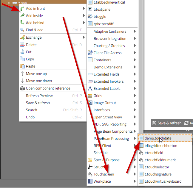
Reload the project within your CaptainCasa toolset
Restart the Layout Editor (by refreshing the URL of the editor)
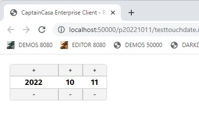
You now can add the component below the “<t:row>” into you layout.
<t:beanprocessing id="g_1" beanbinding="#{d.TesttouchdateUI}" />
<t:rowbodypane id="g_4" >
<t:row id="g_6" >
<zzzz:touchdate id="g_8" actionListener="#{d.TesttouchdateUI.onSomeDate1Action}" enabled="true" value="#{d.TesttouchdateUI.someDate1}" />
</t:row>
</t:rowbodypane>
package managedbeans;
import java.io.Serializable;
import java.time.LocalDate;
import org.eclnt.editor.annotations.CCGenClass;
import org.eclnt.jsfserver.defaultscreens.Statusbar;
import org.eclnt.jsfserver.pagebean.PageBean;
@CCGenClass (expressionBase="#{d.TesttouchdateUI}")
public class TesttouchdateUI
extends PageBean
implements Serializable
{
// ------------------------------------------------------------------------
// members
// ------------------------------------------------------------------------
LocalDate m_someDate1 = LocalDate.now();
boolean m_someDate1Enabled = true;
// ------------------------------------------------------------------------
// constructors & initialization
// ------------------------------------------------------------------------
public TesttouchdateUI()
{
}
public String getPageName() { return "/testtouchdate.xml"; }
public String getRootExpressionUsedInPage() { return "#{d.TesttouchdateUI}"; }
// ------------------------------------------------------------------------
// public usage
// ------------------------------------------------------------------------
public LocalDate getSomeDate1() { return m_someDate1; }
public void setSomeDate1(LocalDate value) { this.m_someDate1 = value; }
public boolean getSomeDate1Enabled() { return m_someDate1Enabled; }
public void setSomeDate1Enabled(boolean value) { this.m_someDate1Enabled = value; }
public void onSomeDate1Action(javax.faces.event.ActionEvent event)
{
Statusbar.outputMessage("Hello: " + m_someDate1.toString());
}
}
When a a Browser-client is sending an event to be processed in an actionListener-method then it does so by sending the information in a String with the format:
<eventName>(<param1>,<param2>,...)
Example: an “invoke” Event of e.g. a button is sent in the following way from the browser-client:
invoke(32,24,50,26,2,false,false,false,1,90,false)
On server-side this String is converted into an event object of type “BaseActionEvent”. There is a sub-class for each event, e.g. the subclass for the event “invoke(...)” is “BaseActionEventInvoke”:
public class BaseActionEventInvoke extends BaseActionEvent
{
public BaseActionEventInvoke(UIComponent component, String type)
{
super(component, type);
}
public int getX()
{
try
{
return (new Integer(getParams()[0])).intValue();
}
catch (Throwable t) { return -1; }
}
...
...
}
The implementation of the event class knows the sequence of the parameters – which is available inside the event by calling method “getParams()”. And it knows how to convert the String-based parameter into some other data type if required.
The same mechanism now is used to pass events from server-side control: with Page Bean Component Controls event is created and triggered by calling the method “delegateActionEvent()” and passing the String of the event as parameter:
private void throwFlushEvent()
{
delegateActionEvent("flush(false)");
}
The method “delegateActionEvent” is inherited from class PageBeanComponentAsControlWithAction.
Let's assume you want to create a new event which is “dateSelected”. And inside the event you want to indicate which parts of the date have changed – i.e. if the year and/or the month and/or the day changed.
You might call event in the following way...
delegateActionEvent(false,false,true)
...meaning the the first parameter indicates a change of the year, the second one a change of the month and the third one a change of the day.
To properly process the event you have to creata class “BaseActionEventDateSelected” extending “BaseActionEvent”.
the class name is “BaseAcrtionEvent<eventTypeNameWithUppercaseFirstChar>”
the package is the package that you assigned to you control library
package democontrols;
public class BaseActionEventDateSelected extends BaseActionEvent
{
public BaseActionEventInvoke(UIComponent component, String type)
{
super(component, type);
}
}
When calling the event then the values of the String “delegateActionEvent(false,false,true)” will be converted into a corresponding event of type BaseActionEventDateSelected – which then is passed into the actionListener processing.
The parameters of the event are available by calling “getParams()” in the event implementation – which returns a corresponding String-Array.
You might extend the event in order to properly pass back the parameters:
package democontrols;
public class BaseActionEventDateSelected extends BaseActionEvent
{
public BaseActionEventInvoke(UIComponent component, String type)
{
super(component, type);
}
public boolean isYearChanged()
{
return ValueManager.decodeBoolean(getParams()[0],false);
}
public boolean isMonthChanged()
{
return ValueManager.decodeBoolean(getParams()[1],false);
}
public boolean isDayChanged()
{
return ValueManager.decodeBoolean(getParams()[2],false);
}
}
When defining an XML “controlevents.xml” with the following content....
<controlevents>
<tag name="demo:touchdate" events="DateSelected"/>
<!-- “events” is a semicolon separated lists of events
triggered by the component -->
</controlevents>
...then the Layout Editor of the CaptainCasa toolset will automatically show the user the events that are triggered by the component. The file is to be placed into the package <controllibPackage>/resources – the same package in which the “controlsarrangement.xml” file is placed.